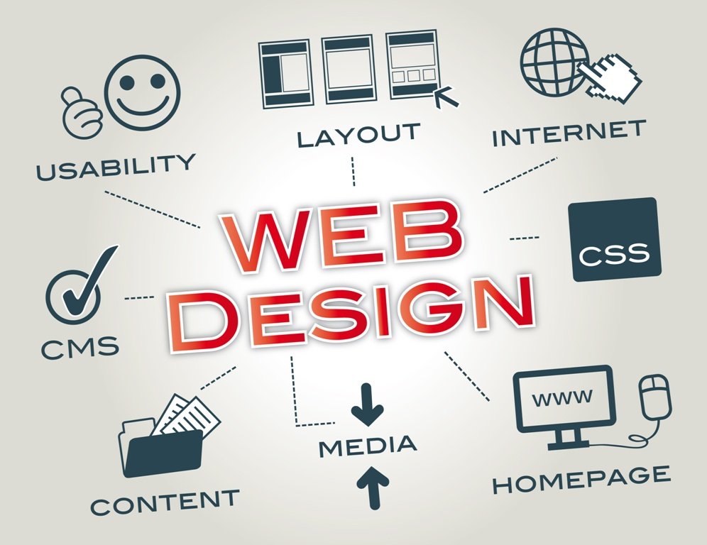
When you begin your search for the perfect web designer for your website, you may noticed that, at least on the surface, all web designers seem pretty much the same. However, this couldn’t be any further from the truth. A good web designer understands the principles of good web design and will provide you with a website that has the potential to put you at the top of your niche. Here are some things that you should know about web design in order to aid you in your web designing company selection process.

Precedence (Guiding the Eye)
The main goal of a website is to provide information to your reader. In order to do this, a website needs to be able to guide the eye around the page through the use of various visual images. For example, website branding is accomplished by placing the logo in the upper left hand corner of the page, the place that experts say is the first place consumers look when viewing a web page. Being able to establish a strong precedence is through the use of various tools such as element position, color, contrast and size will determine how successful your site will be.
Spacing
Negative space is as vital to the overall website design as the elements themselves. Good website designers can adequately manage negative space to ensure that the layout of each page is clean and uncluttered. In web design, there are three places where spacing is important: line spacing, padding between elements, and the overall white space management on the page.
Navigation
Readers need to be able to find and use the navigation controls on a webpage intuitively. If they can’t find it, they won’t use it, leaving your page for another that they can. Customers will need to be able to identify both where they are in a website and where they can go.
Design to Build
Life has gotten a lot easier since Web designers transitioned to CSS layouts, but even now it’s still important to think about how you are going to build a site when you’re still in Photoshop. Consider things like:
- Typography
The text of a website should be an easy to read font that is the right size to allow for easy reading without being so large that it is overwhelming. You don’t always have to use a plain font, but it should be easy to read for all readers. The color of the font needs to be of a high enough contrast that it stands out from the background well enough to be easily read. - Alignment
Good website designs keep everything aligned properly. If things aren’t aligned, the whole site looks cluttered, disorganized and ultimately unreliable. Elements need to be consistently aligned on the page to keep consistency throughout. Good web designer use a grid to keep everything properly lined up and create a polished look. - Consistency
Consistency throughout the website is the key to creating a professional looking site. Each page should have the same look and feel, using the same colors, fonts, spacing, headers etc. to create a more uniform and polished look.
Of course, there are many other things that go into making a good website. But, using this guide, you can easily look through a web designer’s portfolio and weed out the designers that aren’t up to par.


